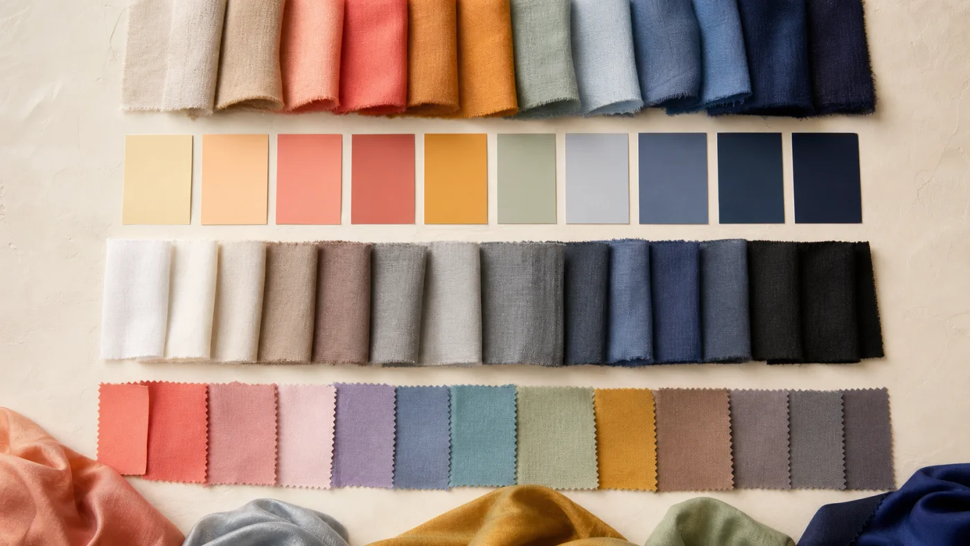
Four questions, not one label
Every wearable color can be described in several ways. Is it relatively warm or cool? Is it light or deep? Is it clear and vivid or softened and muted? How much difference does it create beside the other colors in an outfit? These questions are the working vocabulary behind seasonal color analysis.
The dimensions are continuous. A color is rarely simply warm, dark, or muted in isolation; it is warmer, darker, or softer than the option beside it. This is why side-by-side comparison is more informative than trying to memorize a long list of color names. See how the 12-season color analysis map uses these dimensions and read seasonal color analysis explained.
- Temperature
- Warm ↔ cool direction
- Value
- Light ↔ deep relative brightness
- Chroma
- Soft ↔ clear intensity
- Contrast
- Gentle ↔ strong difference
Temperature and value
Temperature describes a color’s warm or cool direction. A tomato red leans warmer than a raspberry red; an olive green is usually warmer than an emerald green. Neutral-looking colors can also lean: cream is warmer than optic white, while blue-grey is cooler than camel.
Value describes relative lightness and darkness. Pale blue and midnight blue may share a hue family but create very different visual weight. A light palette tends to stay closer to the lighter end, while a deep palette can hold richer shadows without the color becoming the only thing you notice.
Chroma and contrast
Chroma describes how vivid or muted a color appears. Clear coral has stronger chroma than dusty terracotta. Muted does not mean boring, and vivid does not mean better; each creates a different relationship with texture, pattern, and the surrounding colors.
Contrast describes difference. It can come from light beside dark, complementary hues, a vivid accent on a neutral base, or crisp edges in a print. Your analysis may suggest a comfortable contrast range, but contrast is also a creative control: lower it for a blended result or raise it deliberately for emphasis.
- Temperature: warmer ↔ cooler
- Value: lighter ↔ deeper
- Chroma: softer ↔ clearer
- Contrast: gentler ↔ stronger
Find your color season with Chroma
Use the four dimensions to explore your season, save a personal palette, and compare real colors.