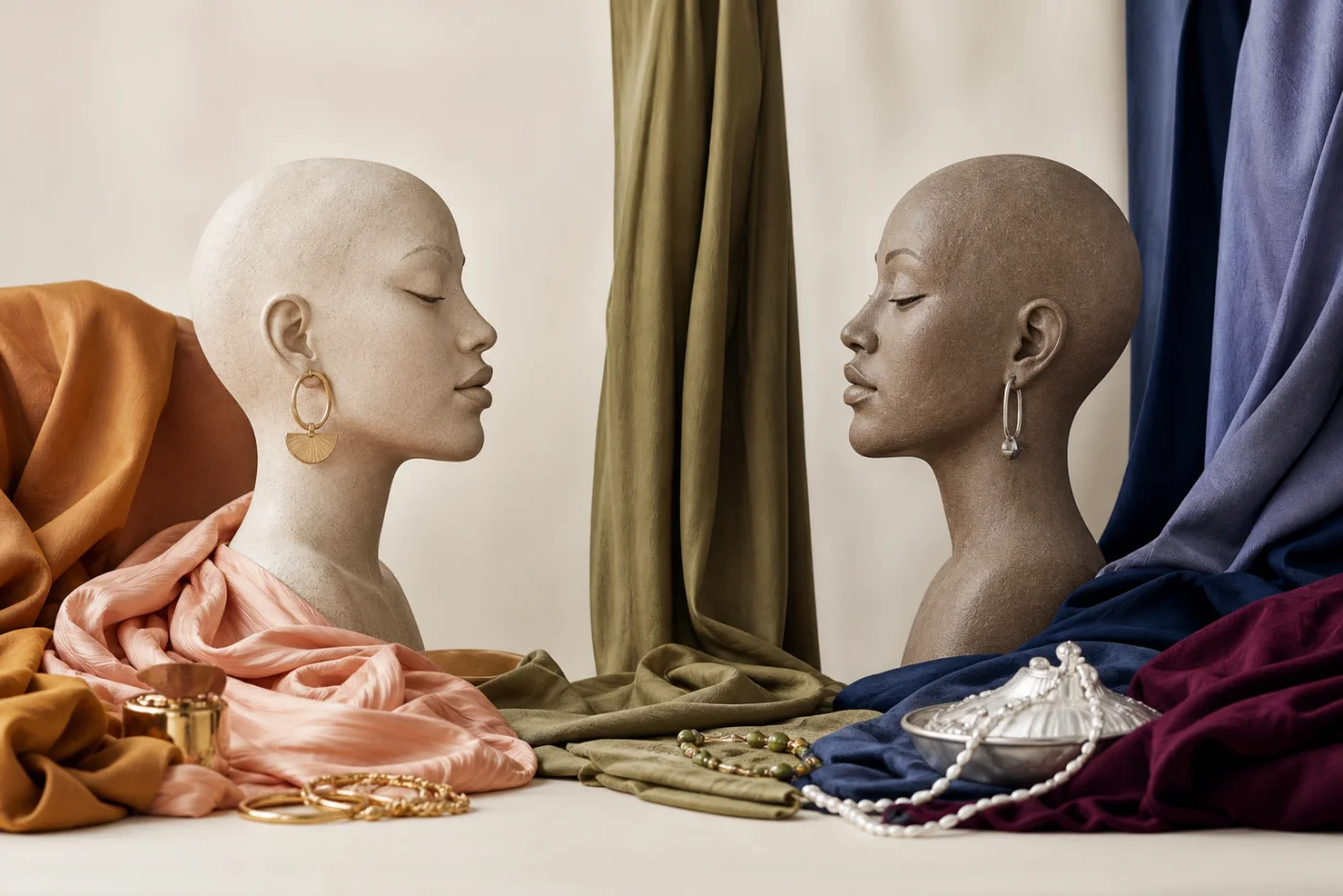
Compare within a color family
Warm and cool are easiest to see when two versions of the same hue sit together. Coral leans warmer than fuchsia, grass green warmer than pine, and camel warmer than mushroom grey. The label on a product rarely captures this nuance, so direct comparison is more reliable than memorizing names.
A color can be warm in one comparison and relatively cool in another. Navy may look cool beside brown, yet warmer beside an icy blue-black. Neutral colors are not free from temperature; whites, greys, denims, and metallics all shift along the same continuum.
Undertone is a styling observation
In personal color analysis, undertone describes the temperature direction that appears harmonious in a specific set of visual comparisons. It should not be treated as a medical characteristic, a rule about skin color, or something that can be proven by vein color alone.
Skin can contain warm, cool, olive, and neutral-looking notes at the same time. Surface redness, tanning, lighting, and camera white balance can alter what a photograph emphasizes. Controlled comparisons and repeated observations are more useful than a single shortcut.
Test the effect you prefer
Try two neighboring choices—ivory and soft white, peach and rose, camel and taupe—under the same diffuse light. Look at the whole face rather than one feature. Does one option make the color itself dominate? Does the other make the overall view feel more connected? Neither effect is objectively more beautiful.
Temperature can also be balanced. A cool top may feel intentional with a warmer lipstick, or a warm coat can be separated from the face by a neutral scarf. Styling is a composition, not a pass-or-fail swatch test.
Put your color knowledge into practice
Use Chroma to explore your seasonal direction, save a personal palette, and compare colors in clothes and makeup.
Download Chroma