Value changes visual weight
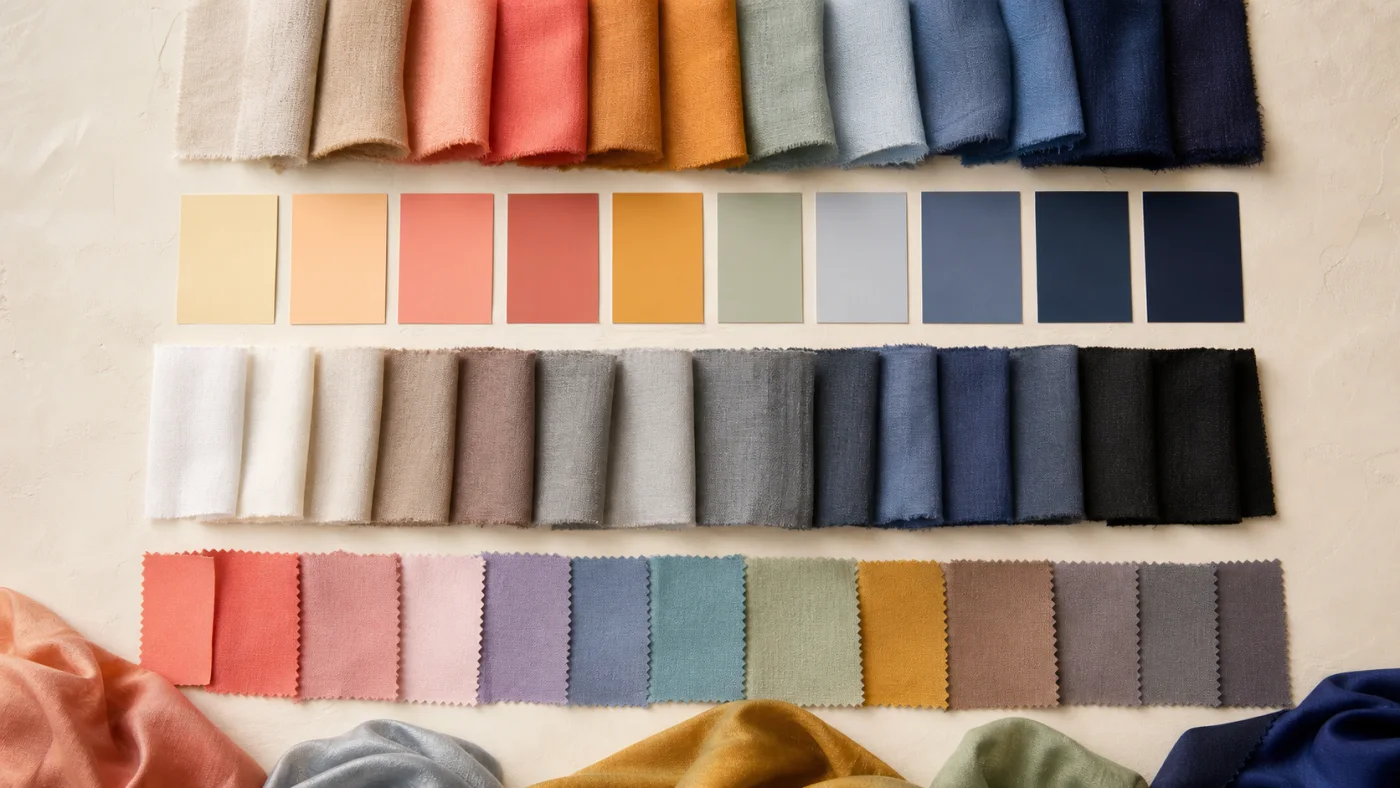
Value is the light-to-dark dimension. Adding lightness creates airy, lower-weight colors; adding depth creates visual gravity. Value often matters more than the hue name: soft navy and powder blue may both belong in a cool palette, but they play different roles in an outfit.
Value is also relative to what surrounds it. A medium grey appears light beside charcoal and deep beside white. When choosing a neutral, compare it with the rest of the wardrobe rather than judging the swatch alone.
Chroma changes intensity
Chroma describes the apparent purity or intensity of a color. A vivid cobalt has higher chroma than a greyed denim blue. Soft colors contain less visual intensity, often through mixing or the way the material and lighting scatter the color.
Pastel and muted are not interchangeable. A pastel is light, while a muted color is lower in chroma. A pale lemon can be light and clear; a smoky teal can be deep and muted. Describing both dimensions prevents frustrating shopping mistakes.
Translate dimensions into clothes
If lighter values suit the effect you want, use depth in smaller areas or farther from the face. If deep colors feel at home, build them into coats, knitwear, and large wardrobe foundations. If soft chroma is useful, seek heathered yarns, washed dyes, and blended prints. If clearer chroma works, look for clean color separation and fewer greyed undertones.
These are options, not restrictions. An intentionally vivid accessory can enliven a muted outfit, and a pale shirt can create useful relief in a deep wardrobe.
- Light + clear: fresh and airy
- Light + soft: hazy and gentle
- Deep + clear: rich and defined
- Deep + soft: smoky and grounded
Put your color knowledge into practice
Use Chroma to explore your seasonal direction, save a personal palette, and compare colors in clothes and makeup.
Download Chroma