Begin with the job of the item
Before comparing color, decide what the garment must do. Which outfits should it complete? Will it sit near the face? What climate, dress code, comfort, care, and budget requirements apply? A color match cannot make an impractical garment useful.
Bring or photograph the pieces it needs to connect. A slightly imperfect palette color that completes five outfits may be a better purchase than an isolated ideal swatch.
Inspect color and material together
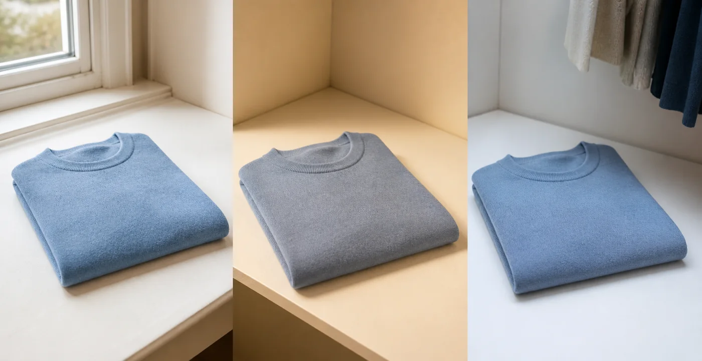
In a shop, step away from strongly colored walls and look near neutral surroundings if available. Check the garment in the fitting room and near indirect daylight without blocking store walkways or exposing it to weather. Move the material to see highlights, pile, and transparency.
Compare neighboring options side by side. If two garments differ in fit or finish, remember that those differences may influence the judgment as much as hue. Save a photo and a note about the light rather than treating a scan score as the whole decision.
Online color needs a margin of error
A retailer’s color chip, model photograph, flat lay, and customer image may all disagree. Review several images, read material and finish descriptions, check whether the color name appears across products, and understand the return terms before ordering.
Screenshots and camera-roll scans can help reject obvious mismatches or compare alternatives, but display and photography differences limit precision. When the decision is close, treat the result as uncertain rather than forcing a confident answer.
- Does it complete at least two real outfits?
- Does the finished fabric behave as expected?
- Have you checked it under a second useful light?
- Would you still choose it without a season label?
Put your color knowledge into practice
Use Chroma to explore your seasonal direction, save a personal palette, and compare colors in clothes and makeup.
Download Chroma